360° Alphabet
Form Studies
2018
Form Studies
2018
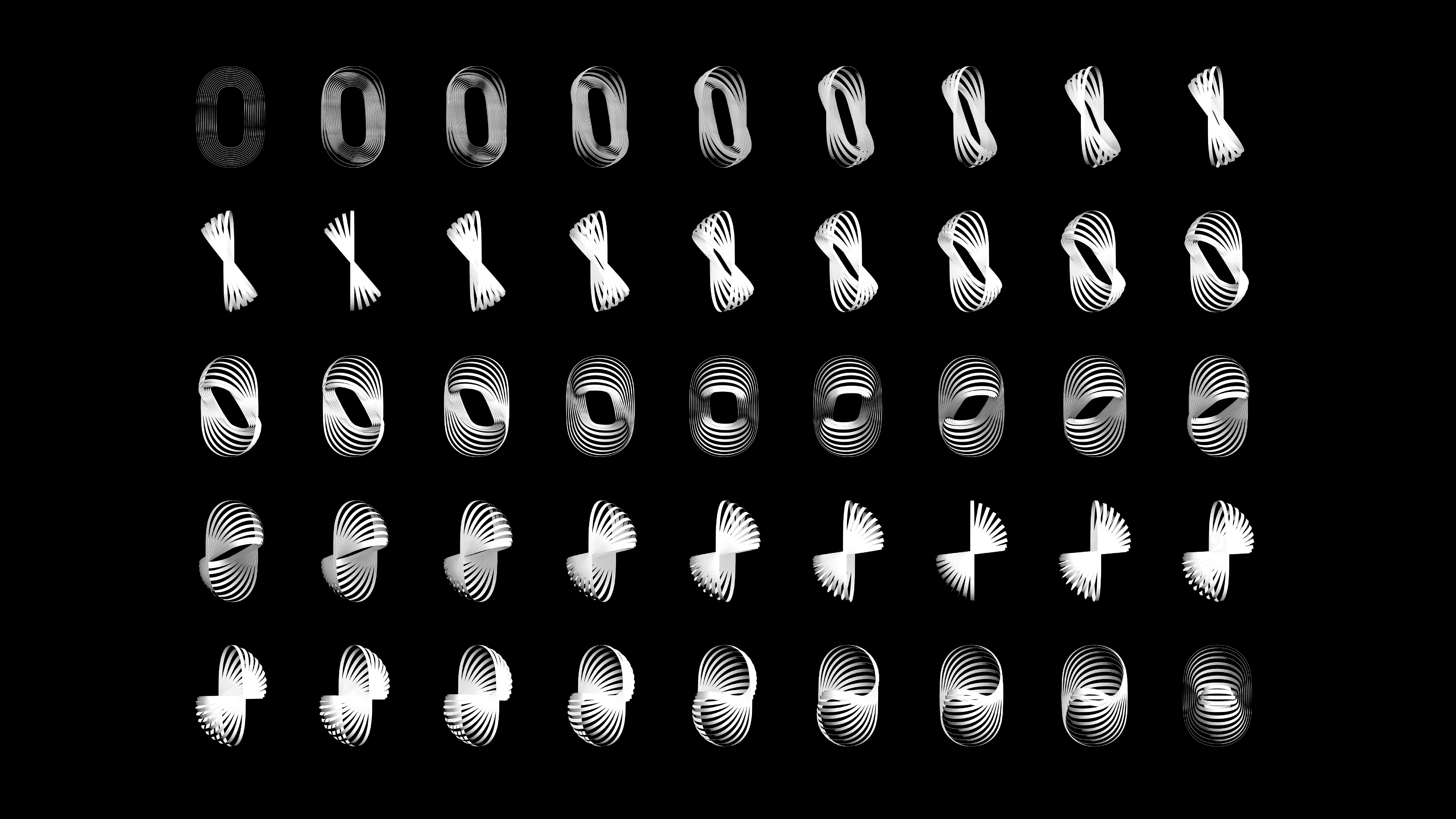
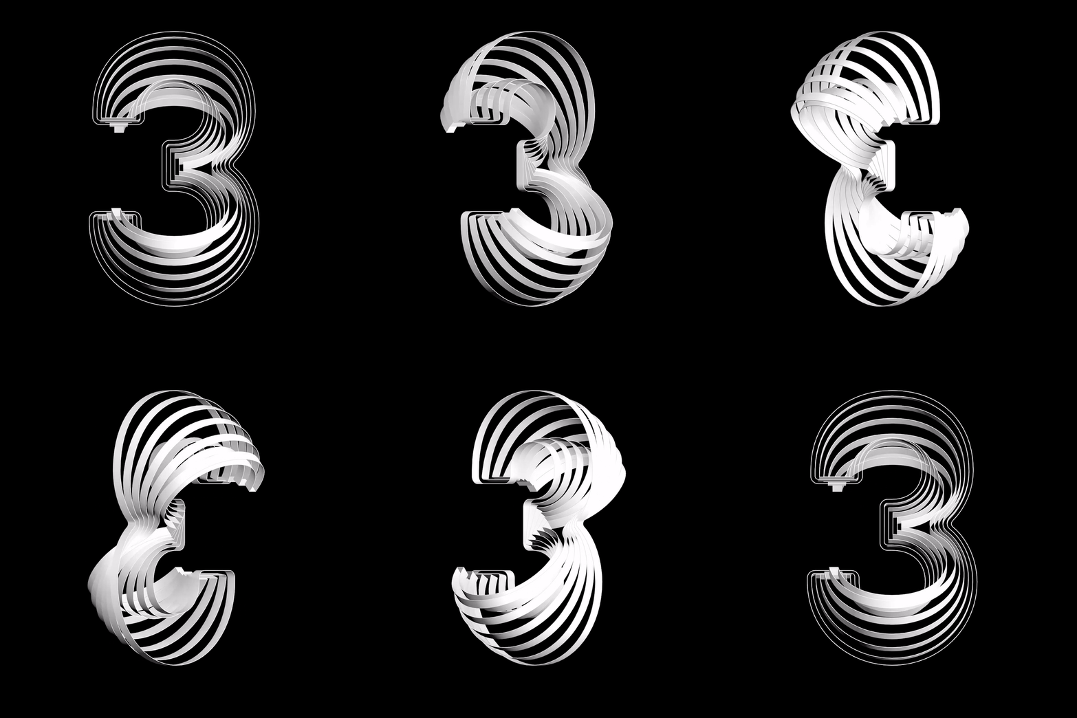
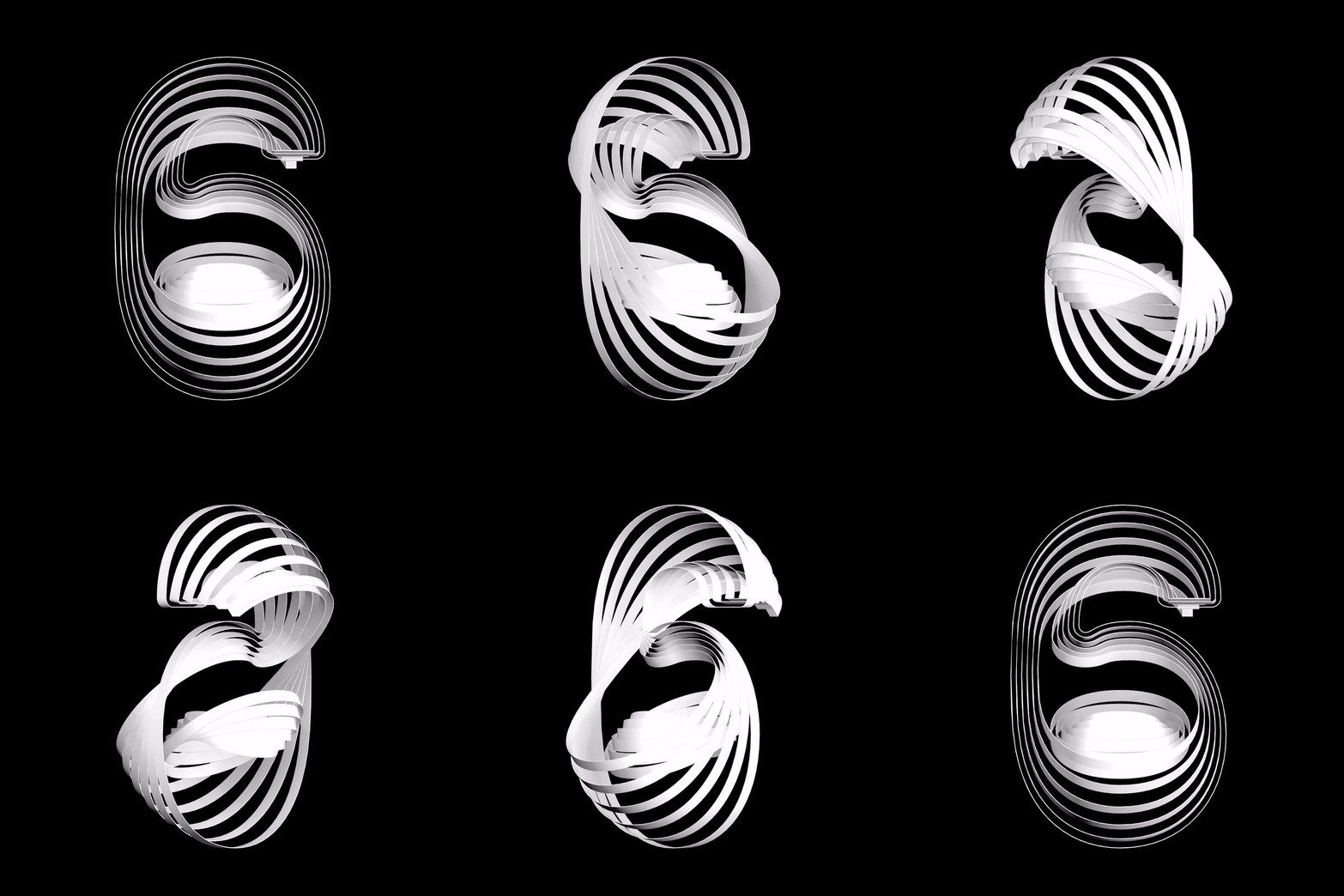
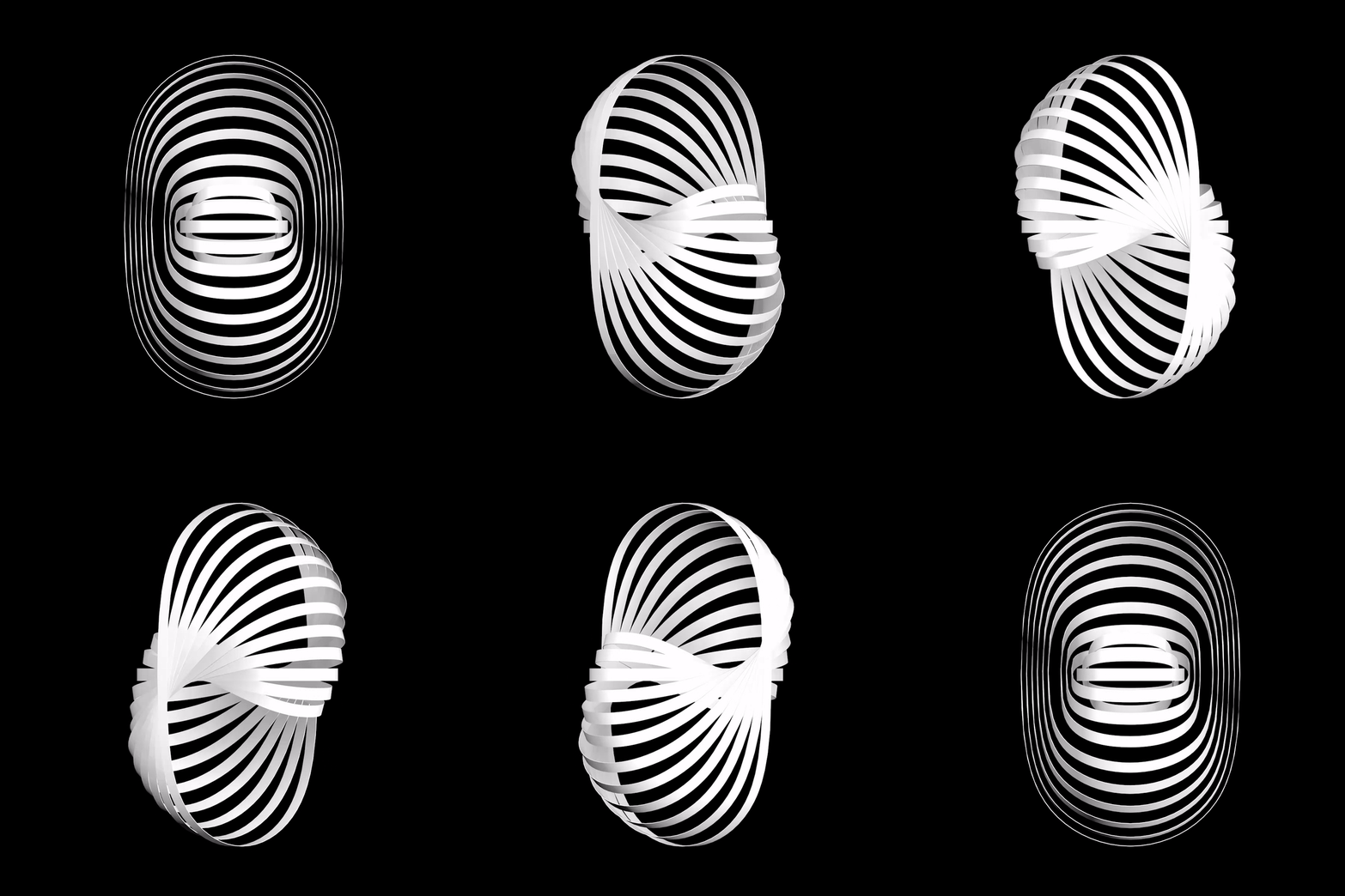
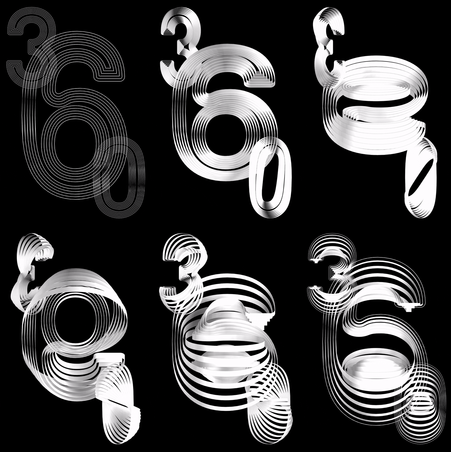
360° Alphabet challenges conventional dimensionality in typeface. Every letterform has a three-dimensional figure which shows different visuals depending on its angle. The inner lines inside of each letter rotate more on the z-axis as they are closer to the center of a letter. Due to the regularity in transformation, all the letterforms look very similar when they turn 90 degrees. As a set, the alphabet has both regularity and irregularity in its form, residing in a three-dimensional world.


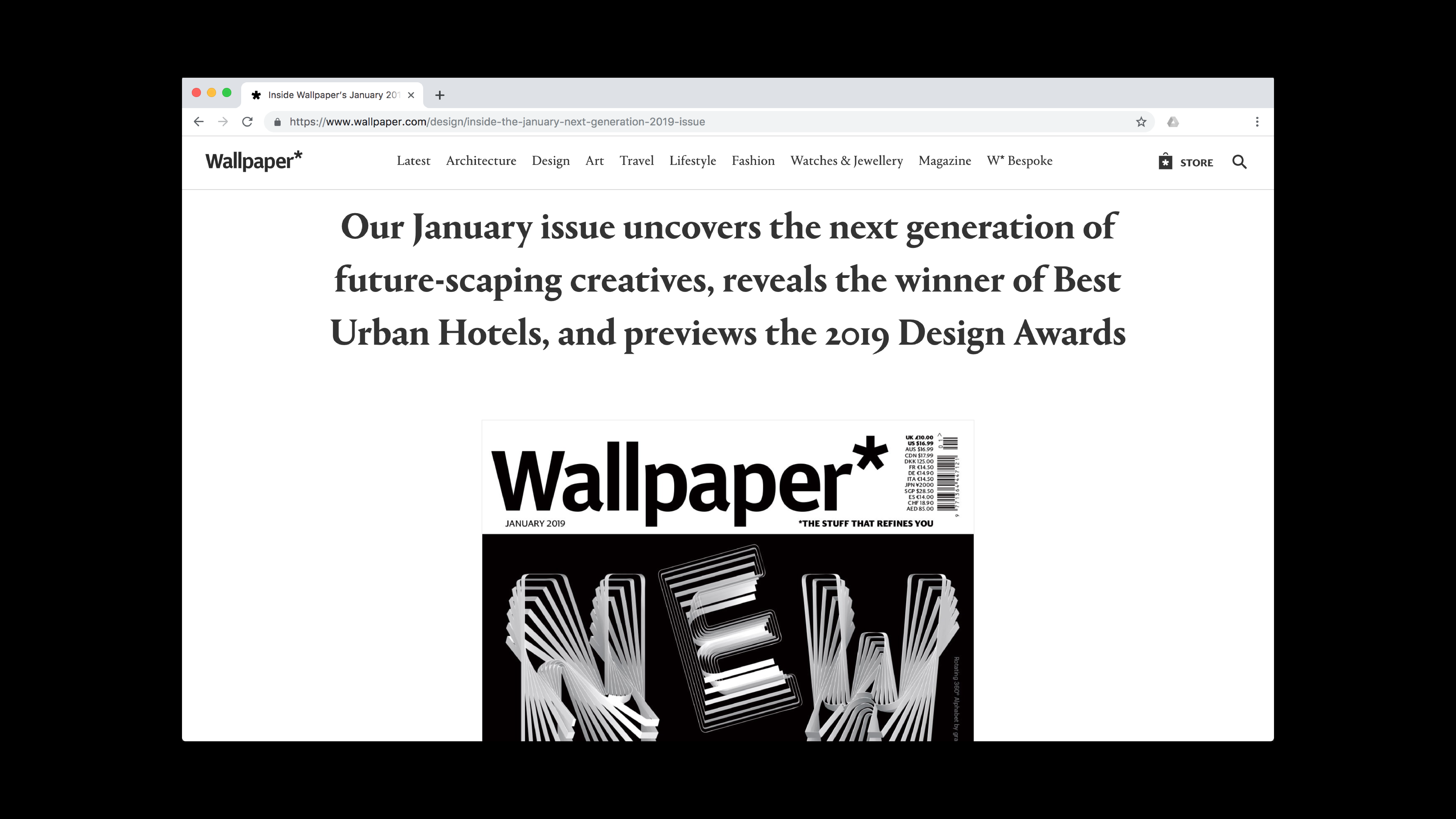
* Featured on Wallpaper* magazine’s January 2019 cover
* Received the “Certificate of Typographic Excellence” from Type Directors Club
* Manipulated GT Pressura Mono Bold, as a creative use of the font.
dlkj